9450 SW Gemini Drive #32865
Beaverton, Oregon, 97008-7105
One way to approach storytelling is to do everything right. In several previous posts, including Data Science Storytelling and Data Storytelling Structure, I offer guidance on how to tell a data story the right way. Another approach is to avoid the most common data storytelling pitfalls, including the following:
In this post, I provide suggestions on how to avoid these common pitfalls.
Imagine scheduling a doctor's visit to review the results of recent lab tests. Your doctor hands you a copy of the results and leads you through the document. Perhaps your fasting blood sugar level is 100 mg/dL; your total cholesterol is 270 mg/dL, LDL is 220, and HDL is 50; and your triglycerides are at 160 mg/dL. Your doctor says, "Well, the data speaks for itself."
Or imagine turning on the local news and having the meteorologist present a bunch of charts that show changes in temperature, humidity, and barometric pressure over the last 48 hours, along with maps of low- and high-pressure systems across the country. She wraps up by saying, "Well, the data speaks for itself."
As you can see, raw data, even when accompanied by data visualizations such as tables, charts, and maps, can be meaningless without expert interpretation of that data. When you consult an expert, you want the expert's opinion and practical advice — expert insight drawn from the data. In the same way, as a member of the data science team, you must interpret the data for your audience or at least lead the audience through the process of understanding the data and drawing reasonable conclusions of their own.
If your data science team is working in the context of a traditional corporate culture with a strong hierarchy, your team may be discouraged from telling stories or interpreting the data. In organizations like these, presenting the data and visualizations and letting management interpret the data are the politically safe options. Your team simply plays the role of impartial presenter.
The problem with this approach is that the data science team is responsible for the outcome, even if management misinterprets the data.
Although the data science team should certainly be open to different interpretations of the data, team members should interpret the data on their own and clearly communicate their findings. The team should do this by telling a story that connects the dots and extracts meaning from the data. Don't give anyone else carte blanche over interpreting your team's data and visualizations.
Data science is a high-tech pursuit that involves a great deal of specialized language and acronyms. This specialized language is like shorthand — it enables people in the field to communicate efficiently and effectively. Every field has its own specialized language (jargon). If you've ever read a study published in a medical journal, you probably needed a translator to define some of the terminology. However, when a doctor meets with a patient, the doctor uses more common terminology to explain the patient's diagnosis and treatment protocol.
In the same way, when you tell a story, consider your audience and speak to them in a language they understand. Don't use the same language you use with your colleagues on the data science team.
New data science teams often struggle with the idea of creating a story from data. Some data just looks like lifeless columns of numbers. Data visualizations are more attractive but can be equally cryptic. How do you tell a story with a chart?
It's a real challenge for data science teams to reverse engineer tables and charts to tell the story behind the data. Frankly, it’s one of the biggest challenges. One way to overcome this challenge is to humanize your reports. For example, instead of calling a report "Upcoming consumer trends," call it something like, "What people are buying." This simple solution makes it easier to think about your data in terms of real-world events and activities.
Business intelligence (BI) tools produce a dizzying array of data visualizations, making it incredibly tempting to create and use every visualization imaginable to illustrate your presentation. Avoid the temptation. Slides are great for displaying data that supports your claims, but if you or your audience becomes too focused on the data, you will all be distracted from what's most valuable — the interpretation of that data.
Count your slides. As a rule of thumb, if you have 30 slides for a 60-minute presentation, you have too many, and you're not telling a story. Keep in mind that the charts are the first things your audience will forget. To achieve maximum impact, focus on the things your audience will remember. Your audience is more likely to remember a clear, interesting story.
Like any skill, data storytelling takes time to improve. Start thinking about the key elements of a story — plot, setting, characters, conflict, and resolution. Then strive to weave those elements into a story around the data that reveals its meaning and significance and will connect with the target audience.
Over time, your stories will become more robust and interesting. You might even draw stronger conclusions and bolder interpretations. Try to remember to have fun with your stories and your audience. It will improve your stories and make you a more interesting storyteller.
A metaphor is a figure of speech used to describe an object or action in comparison to something that is dissimilar but has something in common. Here are a few examples:
Numerous metaphors are woven into the fabric of data science itself, such as "data warehouse," "data lake," and "data mining." Metaphors are essential to the way humans communicate and process ideas. They enable us to more quickly and easily grasp and assimilate the unfamiliar by comparing it to what is familiar.
When people use metaphors to communicate, you may not even realize they're doing so; in fact, they may not even realize they're using metaphors. However, when composing a data science story, you should consciously look for opportunities to tap the power of data storytelling metaphors, especially when introducing new or complex ideas or concepts. In fact, your entire story may be a metaphor — in the form of a parable or fable — used to illustrate a point you are trying to convey. Remember that metaphors link the unknown to the familiar; your audience is more likely to feel a connection with a story that's familiar to them.
You probably know about other figures of speech that involve comparisons, including the following:
Simile: A comparison between two objects or actions typically introduced with a word such as "like," "as," or "than." For example, "quiet as a mouse" or "more fun than a barrel of monkeys."
Analogy: An extended comparison of two similar but distinct objects or actions for the purpose of showing that the two are similar in more ways than one. (Some people think of "analogy" as a comparison and "simile" and "metaphor" as two ways to express that comparison.)
Allegory: A symbolic, fictional story, poem, or picture that conveys a broader message or lesson about life. For example, the novel Animal Farm, by George Orwell, serves as a satire of totalitarian governance.
Tip: Don't get caught up in the differences between metaphor, simile, analogy, and allegory. In storytelling, think in terms of making comparisons and connecting the unfamiliar to the familiar.
Imagine your data science team is working for a chain of movie theaters. Whenever a new release is available, management wants to know how many screens to show it on in each theater to maximize revenue. Showing the movie on too many screens leaves a lot of empty seats. Showing the moving on too few screens fails to capitalize fully on potential ticket sales.
Your team decides to develop a predictive analytics algorithm to calculate the number of screens on which to show the new release. Your team gathers structured and unstructured data. The structured data shows that people are watching the trailer on numerous websites. The unstructured data indicates high volumes of "mentions" about the movie on Twitter, Facebook, and other social sites.
When your data science team presents its findings to the client, it has two options. The first option is to present the data in language that's familiar to the data science team; for example, "Our analyses of both structured and unstructured data suggest a broad interest in the new release."
The other option is to speak in a language that's familiar among movie theater managers and harnesses the power of metaphors. For example, you may say something along the lines of, “We are picking up a lot of friendly chatter on social media, and traffic on sites that are showing the trailer is through the roof. You are definitely looking at a potential blockbuster.”
Through the use of more descriptive language, including metaphors, you convey the information and insight in a way that's easy for theater managers to understand. They immediately know not only the value of the data but also the sources — websites and social media venues. Instead of asking you to define "structured data" and "unstructured data," they'll ask meaningful questions, such as, "How accurate is the level of friendly chatter in predicting ticket sales?"
Your team may use other metaphors, as well, such as describing tickets for the show as hot tickets or explaining that a few weeks after the initial release of the movie, theaters could expect to see interest in the movie cool off. These metaphors make the story more interesting and fun, which keeps your audience engaged and helps them extract meaning from the data.
Metaphors are great for breaking down language barriers that stand between you and your audience, especially when you have complex concepts or ideas to convey. When you're working with colleagues on your data science team, you naturally use terminology that's familiar with team members. Don't assume that same language is understandable or interesting to others.
Metaphors not only make your story sound more interesting, but they also lower the bar to participation. The more your audience engages, the more likely they are grasp the meaning and significance of the data and the conclusions you've drawn from it.
In Paul Smith's book Lead with a Story, he describes how the CEO of Procter & Gamble would come to presentations and sit with his back to the screen. Smith describes how he delivered a presentation to the CEO, who didn't once turn around to look at the slides. After the presentation, he realized that this wasn't by accident. CEOs in large companies see data all the time. They know the data is the vehicle and that the story the presenter tells holds all the value.
When your data team is composing a story, don't get hung up on the data and on creating dazzling visualizations. Spend more time to make data storytelling personal. Without a great story behind them, the data and visualizations are relatively useless. The story connects the dots, reveals the data's meaning and significance, and educates and transforms the audience.
Your job as a data science team is to reveal the humanity behind the numbers. You need to get personal.
Suppose you're walking through an airport and you notice a cell phone on an empty seat with nobody near it. You pick up the phone to discover that it's unlocked. Being the considerate person you are, you want to return the phone to its rightful owner. How would you go about doing that?
You carefully consider your options. Maybe you should just leave the phone where it is, because you know that there's a high probability that the person who left it there would soon remember and return to the spot to reclaim the phone. However, there's also a high probability that someone else will pick up the phone before its owner returns. Maybe you should turn it in to the desk at the nearest gate, thinking that the person may have boarded a plane at the gate and hoping that one of the flight attendants could get the phone to the passenger prior to departure. Or, maybe you should hold on to the phone assuming the owner would use a borrowed phone to call his own phone and find out where it was.
Now suppose you're telling your story later and recounting the thought process you engaged in to decide on the best course of action. You're a data scientist, so after the event, you perform some research on lost cell phones, analyze the data, and create charts to illustrate the probability of the different scenarios you considered. Now the time has come to tell your story.
You have two options. First option: You could flip through your slides and explain each one in turn. Maybe you have a slide that shows a correlation between the phone value and the likelihood that the owner would return to claim it. You may have another slide that shows the percentage of phones that are turned in at airports and train stations and never claimed. A third slide shows a correlation between lost phones and the number of owners who find their phones by calling their own numbers.
Second option: You get personal. You tell the story in a more human way. For example, you might start with the following:
Two weeks ago, I was passing through LAX, when I spotted a cell phone on a seat at one of the gates with nobody near it. I picked up the phone and was surprised to discover that it wasn't locked. I checked text messages and emails to see if I could find any flight information. I walked over to the desk at the nearest gate and asked the attendant whether anyone had reported a lost phone. She pulled out a box from below the counter and showed me its contents — about 20 phones that were turned in only this past week. I returned to the seat where I found the phone and sat there for about ten minutes hoping that the owner would return to claim the phone or would borrow a phone from another passenger to call. No such luck . . .
Which presentation would you find more interesting — the slide show or the story? Rhetorical question. Of course the story is more interesting, but why? With the slide show, you're removing the human element from the story. You have no characters — no you, no owner of the lost phone, no flight attendant. You have no plot, no setting, no conflict, no resolution. All you have are numbers, statistics, and slides. Boring.
When you tell your data science story, you want to take the focus off the data and place it squarely on the story. You want all eyes on you, pens down, and electronic devices stored safely and quietly away. Audience members should only glance occasionally at the slides. If they spend too much time looking at charts or graphs, chances are they’re thinking about something else. Only after the story hooks the audience members and connects with them personally and on an emotional level will they be receptive to the knowledge and insight you impart and be inspired to embrace whatever change you recommend.
In several previous posts, including "Data Science Storytelling," I cover the essential elements of a data science story, but storytelling goes beyond the story itself. It's the telling of the story that separates a gripping story from one that is merely an accurate accounting of events. To make data storytelling pop, you need to believe it and be passionate about it. Only then will you be able to transfer that passion and conviction to your audience. In short, you need to sell it.
When I was a law school, I took a course on litigation. I learned that part of being a successful lawyer is the ability to make the jury empathize with your client. A jury would always want to know the backstory — how the plaintiff and defendant arrived at this point, what made the plaintiff file suit, what did the defendant do and why?
The professor, who had several years' of jury trials behind him, offered some common-sense advice — say what you believe and say it with clarity and passion. He warned against trying to make ordinary stories extraordinary because what you know is the only account you can truthfully represent. Making up a far-fetched story about what happened is only likely to undermine your credibility.
The same holds true when you're telling a data science story. Don't try to fake it or feign interest in a topic or issue that is no interest to you. The audience will quickly pick up on any insincerity, and at that point, your credibility is shot.
If you've ever been on the receiving end of a good sales pitch, you know the secret ingredients — a salesperson who loves what they do and truly believes that the product would significantly improve your life in some way. It's almost as if the salesperson would buy one for you, if she could afford it, just so you could experience its benefits for yourself. With a good sales pitch, you can hear the passion and conviction in the person's voice and witness it in the person's body language.
On the other hand, if you've ever been on the receiving end of a lousy sales pitch, you probably could feel that you were being sold to — that the salesperson was overselling the product and was motivated by profit, not by a commitment to serve your best interests. Or maybe you felt that the person hated her job or was reluctant to sell this particular product; in other words, the salesperson wasn't sold on it herself.
When a data science team lacks conviction, it often becomes apparent in their use of data visualizations. Instead of telling a convincing story and backing it up with visualizations, the visualizations become a distraction to draw attention from the fact that the story really isn't all that interesting. The team thinks that by dangling a little eye candy in front of the audience, they won't notice that the team has nothing important to say.
Following are a few suggestions for presenting a story in an interesting way:
Remember that you are the most important part of your presentation. Beautiful charts, clever anecdotes, and piles of data won’t make up for a lack of passion, humor, and grace. Even the most extraordinary data will seem boring if you can't tell it in an interesting way. The key is to make sure that you believe that the story is interesting. If you can’t convince yourself, you won't convince an audience.
In a previous post, "Data Storytelling Structure," I provide guidance on the big picture of storytelling — nailing down the five key elements of a story: characters, setting, plot, conflict, and resolution. However, if you've ever heard someone tell a story, you know it takes more than those five elements to make it interesting. The devil is in the details. Skilled storytellers embellish their stories with plenty of details that feed the imagination and stimulate the senses. They make you feel as though you're watching the action unfold before your eyes.
In a similar fashion, your data science team should include plenty of details in every story it tells to flesh it out and make it more memorable. Details are like little mental sticky notes that help the audience remember the characters, setting, plot, conflict, and resolution. In addition, the details provide supporting evidence to the larger observations and claims being presented by the team.
An organization I once worked was struggling to get enough people to participate in its medical studies. The data science team was called in to figure out why. The team conducted some research and discovered that some people are afraid of needles, others are afraid of having their blood drawn, and a cross-section are afraid of both. This cross-section represented a lot of people.
The data science team asked some good questions and made some interesting discoveries. One such discovery was that people who participated in and had a positive experience with a medical study that did not involve needles or blood draws were more inclined to participate in future studies that die involve needles or blood draws.
The research lead (a nurse) had a great idea on how to tell that story with impact. She would start with a case study, changing the participant's name and a few details to protect the patient's anonymity. Her story went something like this:
When I was a nurse I could always tell who was afraid of needles. They always crossed their arms in a certain way. They grabbed both of their elbows as a way to protect themselves from the poke in the arm. There are a lot of people out there like that, and we need them to participate in our medical studies. So I'm going to tell you a little bit about someone I found in one of our reports.
Let's call her Tracy. She participated in one of our medical studies for a drug being developed to help people sleep. The first day of the study she showed up with her own pillow. She must've been optimistic about how well it would work. She was hoping that this new pill would help her since she had some trouble sleeping during periods of high stress.
It turned out that Tracy was one of the participants who didn't get any benefit from the drug. When she left, she told the nurse that her father was a doctor, so she felt some obligation to participate in medical studies. She said she could never be a doctor because she was scared of blood and needles. A few months later she decided to participate in a flu vaccine trial. The study required needles for the vaccination and for later blood tests.
So why did Tracy decide to participate?
The obvious answer the research lead's question is that Tracy participated because she felt an obligation to do so. After all, she didn't actually benefit in any way from the sleep study. She felt as though she couldn't contribute to helping others with their health issues directly by being a doctor or nurse, so she would do her part by participating in studies.
Now, think about the story you just read. What do you recall? Clearest in your mind are probably the details — the description of how people held their arms when they were afraid of needles, Tracy's name, Tracy bringing her pillow to the sleep study, what her dad did for a living, the trials she participated in, and so on. All of these details make it easier to remember the story and to remember the conclusion drawn from the story — that Tracy participated in medical studies because she felt obligated to do so.
When you tell a data science story, try to use details to paint a picture in words. They help your audience connect to characters, setting, plot, conflict, and resolution.
Data science is a combination of science and art. The data science team follows the scientific method to explore and discover — to add to the organization's growing body of knowledge and insight. The team then uses the art of storytelling to convey that knowledge and insight to people across the organization in a compelling and memorable way.
Business presentations are boring. They're not structured to be interesting. They're static. They communicate the current state of affairs. They’re like a verbal “reply all” to the organization's stakeholders. That’s usually fine for status meetings, but it falls short when you need to convey a point, make it stick, and transform the audience in a positive way.
Avoid the temptation to merely deliver reports or presentations. Use the data and the findings from your analysis to tell a compelling story. And be sure to include the details.
When your data science team is composing a story, it needs to understand the data storytelling audience in order to connect with it on a personal and emotional level. I witnessed this myself when working for a large political campaign in 2000 and observed two candidates deliver their campaign speeches — one who connected with the audience on a personal and emotional level and another who didn't.
First, the candidate who didn't: He was speaking to a group of people who had lost many jobs over several decades. He stood in the red skeleton of an old industrial building and talked about his proposal for job training. He explained how job training would benefit members of the audience by equipping them with high-tech skills for the evolving economy. You could tell that the audience didn't connect with the story. When he was done, he received polite, scattered applause.
A few days later, the opposing candidate delivered his speech at an old abandoned warehouse next to a lazy brown river. The audience was the same — people who had lost many jobs over several decades. He started by saying, "I know many of you are uncertain. You're not sure that your way of life has a future." He then proceeded to tell a story about the importance of preserving what's important. At the end of the story, the warehouse exploded in applause that continued until the candidate stepped off the stage.
The first candidate didn't get it — he totally misread the audience. This group of voters didn't want to go back to school to learn a new trade; they wanted the world to go back to the way it was when they had good jobs and decent pay. The second candidate understood the audience and spoke to their desires and dreams. He was rewarded accordingly.
As a member of a data science team, you probably won't be speaking to a group of voters, but the same principle applies — to connect with an audience, you need to know the audience. Only by knowing the audience can you tailor your story to connect with audience members on an emotional level, where learning and transformation are most likely to occur.
In most organizations, you can think of audience members belonging to one of the following five groups:
While it's best to understand your audience prior preparing your story, that's not always possible. When presenting to an unfamiliar audience, you can get to know its members a little better through a technique called warming up the room. Five to ten minutes prior to the presentation, as people are settling into their seats, walk around and chitchat with some of the people in the audience. Some of them will tell you what they're looking for directly. You might hear comments such as, "I'm curious to see how this connects to what I'm working on." Then you can ask, "What are you working on?" If something like this happens, you might want to adapt your story in real time to meet your audience’s expectations.
The big takeaway here is to know your audience and anticipate and address their interests and concerns. Otherwise, the audience will merely hear what you say; they won't listen or retain it, and they certainly won't learn or be convinced to change in any way.
As explained in my previous post, "Data Science Storytelling," A compelling story is more than just a chronology of events. If you present a narrative of your uneventful trip to the grocery store to buy a gallon of milk, your audience will begin nodding off long before you reach the part about waiting in line to check out. For a story to capture and hold the audience's attention, it certainly needs a narrative data storytelling structure. That includes characters, setting, conflict, and resolution.
Likewise, the data story you tell an audience requires more than just data and visualizations. The data is only one essential element. As I explain in my previous post, you need to tell a story with that data that engages, entertains, educates, and transforms the audience — a story that changes how the people in your organization think or changes what they do or how they do it.
However, in my previous post, I stopped short of providing any guidance on how to build an effective story. This post is the first in a series that provides detailed instruction on how to compose an effective data story. Here, you discover the basics of structuring your story.
Every story has a beginning, a middle, and an end, and each part of the story has a different purpose. When structuring your story, be sure that each part of the story fulfills its purpose, as explained in the following sections.
At the very beginning of the story, establish the context by introducing the characters (people involved) and the setting (where the story takes place). For example, "We've been closely monitoring customers who purchase shoes on our website. We can see where they live and connect that to how often they place an order.” The characters are customers and the members of the data science team. The setting is the website where the customers shop. This provides a context for the rest of the story.
Tip: Establish the context as quickly as possible. If you take too long (a common mistake), the audience will begin to lose interest.
The longest part of the story is the middle, in which you introduce the conflict and the research performed to resolve the conflict, but stop short of the actual conflict resolution. For example, “Customers in urban areas are more likely to buy running shoes. In fact, the more densely populated the area the more shoes they buy. We thought this was strange. As runners ourselves, we don't really like running in densely populated areas because of the traffic and pollution."
The conflict draws in the audience by introducing a mystery that needs to be solved. The research lead even used a personal anecdote to stimulate curiosity.
Presenting the conflict segues into the research conducted to resolve the conflict or, in this case, solve the mystery. Here's where the team explains where it looked for the data and describes the data and analytics and any experiments the team performed.
Tip: Don't provide too much detail — let your data visualizations do that. For example, you might say, "We noticed that customers in urban areas tend to be younger, but even after adjusting for age, we found a pretty big discrepancy in purchase volume between urban and rural customers. We also looked at some maps where we had a lot of active customers. We wanted to see if there were more runners’ paths within the city, but we were surprised to see more and nicer paths outside the city.”
Notice how the team draws the audience into the mystery while introducing the research and analytics it performed.
At the end of the story, you deliver the big reveal and possibly a call to action. To continue with our running shoes example, the team may end with something like, "It turns out that the strongest connection we found was that customers who lived within three miles of a gym bought more running shoes."
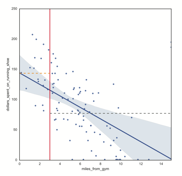
The orange dash line shows average dollars spent on running shoes by customers living closer than three miles from gym versus the grey dash line showing average dollars spent on running shoes by those living farther than three miles from gym.
The team may then present a call to action; for example, "According to our research and analytics, we need to do a better job of promoting our shoes through gyms in urban areas." Or, the team could get the audience involved by challenging audience members to recommend ways to capitalize on the information and insight.
Although a story structure with a beginning, middle, and end is a good start, it's too basic for figuring out how to structure a story that holds the audience's attention. Fortunately, storytellers throughout history have come up with story-telling formulas that work. In his book The Seven Basic Plots, Christopher Booker argues that interesting stories have seven patterns. When structuring your story, you would be wise to choose from one of the following seven plots:
Keep these plots in mind as you tell your data science story. As a storyteller, these plots help define exactly what you're trying to communicate.
Have you ever watched a movie that had great actors, costumes, sets, cinematography, and special effects but a terrible plot? If so, you probably left the movie theater or walked away from your television feeling disappointed. On the other hand, if you've ever seen a low-budget movie with a great storyline, you probably ran around telling all your friends and family members about the amazing movie you just watched.
The value of a good story is important to keep in mind when you're presenting your data team's findings to others in your organization. Many data science teams make the mistake of approaching their presentations as if they're creating a big-budget film. They create beautiful graphs and slides, assuming that these visuals will engage the audience and tell the story — everything that needs to be said, they think, is conveyed by the visuals. But that's not how it works. Making something beautiful doesn't make it interesting or memorable. You need to tell a compelling story. Your story is the star of the show. Your visuals are the supporting cast.
By definition, a story is simply an accounting of incidents or events. In the context of data science storytelling, I like to think of a story as the means to making connections — connecting the dots in the data to reveal its meaning and significance and connecting the data to the audience to teach it something new.
To "spin a yarn" is to tell a tall tale. The phrase originated in the 1800s to describe the process of repairing rope onboard a boat. This time-consuming task involved weaving together numerous fibers. Seamen then began using the phrase to describe the telling of a long, imaginative, and typically improbable tale. Various threads must be woven together to create an entertaining and memorable story.
When your data science team sits down together to spin its own yarns, be sure to weave together the following threads:
Imagine a typical presentation. The title of the opening slide is "Fourth-Quarter Sales Projections." The audience is already yawning.
Now, imagine if the slide contained only the name of the presenter. She steps forward, introduces herself, and begins to tell a story. She starts by saying "Over the past several months, sales have been rising steadily, but our team couldn't figure out why." The audience is instantly hooked. They had expected a long, boring presentation but are now about to see a mystery unfold.
After hooking your audience, you need to keep them entertained. Starting with a mystery goes a long way toward holding the audience's attention until the big reveal at the end, but you can use other communication tools and techniques to keep the audience engaged and entertained, such as:
In the world of data science, one key purpose of a good story is to educate the audience — to convey interesting and relevant information or insights, something the audience didn't already know. At the end of your story, you don't want anyone in the audience asking, "So, as a result of your analysis, what does our organization know now that it didn't already know?" Even worse is if the audience listens closely to the story and walks away from the presentation wondering "So what?" or "Who cares?"
When composing a story, the data science team should be sure that the story is educational as well as entertaining.
The ultimate purpose of a story is to transform the audience — to convey interesting, relevant information or insights that transform strategy, decisions, or behaviors in a positive way for the organization. When composing a story, the data science team needs to identify the main point it wants to drive home and the transformation it hopes the story initiates. In many cases, the story should end with a call to action, stating explicitly the transformation that needs to occur.
While the purpose of a story is to engage, entertain, educate, and transform the audience, you can use various narrative techniques to tell the story. The following five narrative techniques are particularly helpful when you're trying to explain data science concepts to your audience:
Storytelling with your data and analytics is an effective way to engage, entertain, educate, and transform your audience. Although having attractive data visualizations certainly helps, the story you tell will have a greater impact and leave a longer-lasting impression. By following the guidance in this post, you should be better prepared to tell great stories with your data. In subsequent posts, I will provide additional tips and suggestions.
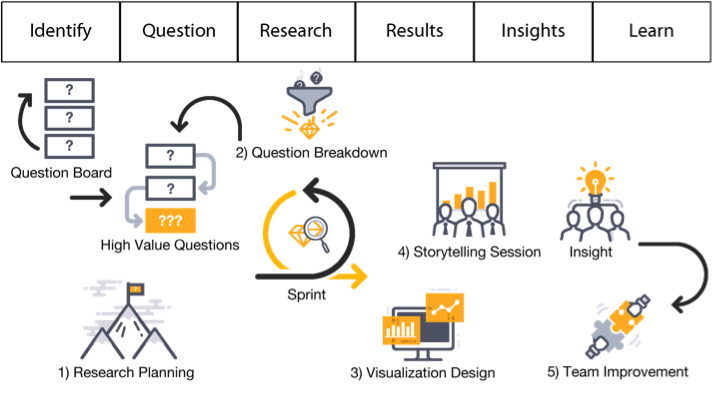
In my previous post, "The Data Science Life Cycle (DSLC)," I encourage you to adopt a structure for your data team's activities that is conducive to the type of work it does — exploration. I refer to this structure as the Data Science Life Cycle (DSLC), illustrated below.

At first glance, DSLC appears to be a linear process, starting with identification and ending with learning, but the process is actually cyclical. Learning leads to more questions that return the team to the beginning of the process. In addition, mini-cycles often form within the DSLC as research and analysis results prompt questions that require additional research and analysis to answer, as shown below.

In this post, I drill down to illustrate how data science teams can function more effectively and efficiently within the DSLC framework by employing the following techniques:
The DSLC isn’t designed to cycle over a long period of time. Two weeks is sufficient for a cycle (a sprint). That gives the team sufficient time to prepare and analyze the data and compose a story that reveals the knowledge and insight extracted from the data and its significance to the organization. With short cycles, if a specific line of enquiry proves fruitless, the team can change course and head in a different direction or tackle a new challenge.
You may have heard of sprints in the context of agile software development methodologies, such as Scrum, but the term actually originated in product development. A sprint is a consistent, fixed period of time during which the team runs through an entire lifecycle. Each sprint should run through all six stages of the DSLC, as shown below.

As I explained in an earlier post, "Data Science Team Roles," teams should be small (four to five individuals) and include a research lead, data analyst, and project manager. Although every member of the team should be asking compelling questions, the research lead is primarily responsible for that task.
One of the most effective ways to inspire and share interesting questions is via a question board— usually a large whiteboard positioned near the data science team on which team members and others in the organization post questions or challenges. The board should have plenty of open space with a short stack of sticky notes in one of the corners. You may want to include a large arrow pointing down to the stack of sticky notes with the caption, “Ask a question.”
The question board should be open to everyone in the organization, including the research lead, other data science team members, executives, managers, and employees. Try to make your question board look as enticing as possible. Anyone in the organization should be able to walk by, grab a sticky note, and post a quick question.
Given only two weeks to complete each sprint, your data science team should limit the amount of time it spends in meetings and keep those meetings focused on a specific purpose. I recommend that teams conduct five meetings over the course of a two-week sprint, each with a specific purpose and a time limit that the team agrees upon in advance:
Breaking down your work involves allocating a sufficient time to all six stages of the DSLC. What often happens is that data science teams get caught up in the research stage — specifically in the process of capturing, cleaning, and consolidating the data in preparation for analysis. Given only two weeks per sprint to deliver a story, the data science team has little time to prep the data. Like agile software development teams, the data science team should look to create a minimally viable product (MVP) during its sprint — in the respect to data science, this would be a minimally viable data set, just enough data to get the job done.
Remember, at the end of a sprint, stakeholders in the organization will want to know "What do we know now that we didn't know before?" If your team gets caught up in data prep, it won't be able to answer that question.
Organizations that make significant investments in any initiative want to see a return on investment (ROI), typically in the form of a deliverable. In the world of data science, the deliverable is typically in the form of an interesting story that reveals both the meaning and the significance of the team's discoveries. Unlike a presentation or data visualization, which merely conveys what the team sees, a story conveys what the team believes. A good story provides context for understanding the data, along with guidance on how that understanding can benefit the organization.
An effective story accomplishes the following goals:
Many organizations think that data science is solely about crunching numbers. Put a bunch of analysts in room, give them access to the data, and within a reasonable period of time, they’ll report back with their numbers and graphs revealing deep business insights. These organizations often assume that the numbers tell the true story. After all, “numbers don’t lie,” right?
Unfortunately, numbers and other factual information are often used to tell lies and spin stories. All you need to do is turn your attention to Washington, D.C. to witness the two competing political parties using the same data in an attempt to support conflicting narratives. For example, one party cites the Mueller report stating that it contains no evidence of collusion, while the other party cites the exact same report and claims that it does not exonerate the president. Yes, data can be used to bend the truth. Studies may arrive at false conclusions. People can misinterpret data. Sometimes, the data itself is misleading or incomplete.
Data science involves more than just crunching numbers or conducting detailed analysis of an issue. It also involves stepping back to look at the big picture, looking at issues from different perspectives, and using human intuition to make big leaps in thinking.
Mining data effectively for knowledge and insight requires that the data science team, along with others in the organization, engage in two types of thinking:
The process of assembling a jigsaw puzzle engages both types of thinking. You look at the picture of the assembled puzzle on the box to transfer the concept to your brain. This conceptual understanding gives you the big picture view that enables you to figure out the general position of each piece. You then analyze each piece based on its color combination and shape to figure out more precise placement.
Data science teams work in a similar manner, alternating between conceptual and analytical thinking. The research lead on the team, who generally has a broad knowledge of the organization and its business intelligence needs, tends to engage more in conceptual thinking. This person asks compelling questions intuitively. The data analysts on the team then collect and analyze the organization’s data to answer the questions. These answers often lead to follow-up questions, and the process continues until the team discovers actionable knowledge or insight.
Data science teams tend to struggle more with conceptual thinking than with analytical thinking. When asked a question or presented with a problem, data analysts have numerous tools and techniques to mine the data for answers and solutions. However, they often have no idea what questions to ask or what problems need to be solved. It takes someone with a curious mind, a knowledge of the organization, and a broad knowledge of the world in general to ask compelling and relevant questions.
An interesting book on this topic of conceptual thinking is A Whole New Mind: Why Right-Brainers Will Rule the Future by Daniel Pink (Riverhead Books, 2005). In the book, Pink argues that we’re near the end of the information age — that focusing solely on numbers and reports isn’t that valuable. The real value will come from the knowledge that we create. He calls this “the conceptual age.”
To prepare for the conceptual age, those engaged in data science will need to develop a new set of conceptual skills — what Pink refers to as the “senses” of the conceptual age. I’ve adapted these senses into three team values that all data science teams should embrace to encourage them to think more conceptually.
Remember that your data science team will have to use an entirely new set of skills to succeed. To ask good questions, you have to think conceptually. Try to use these team values as a way to remind yourself that data science is not solely about analysis and reporting. All members on your data science team need to use their conceptual thinking skills to ask good questions and create organizational knowledge.